
Back To IT
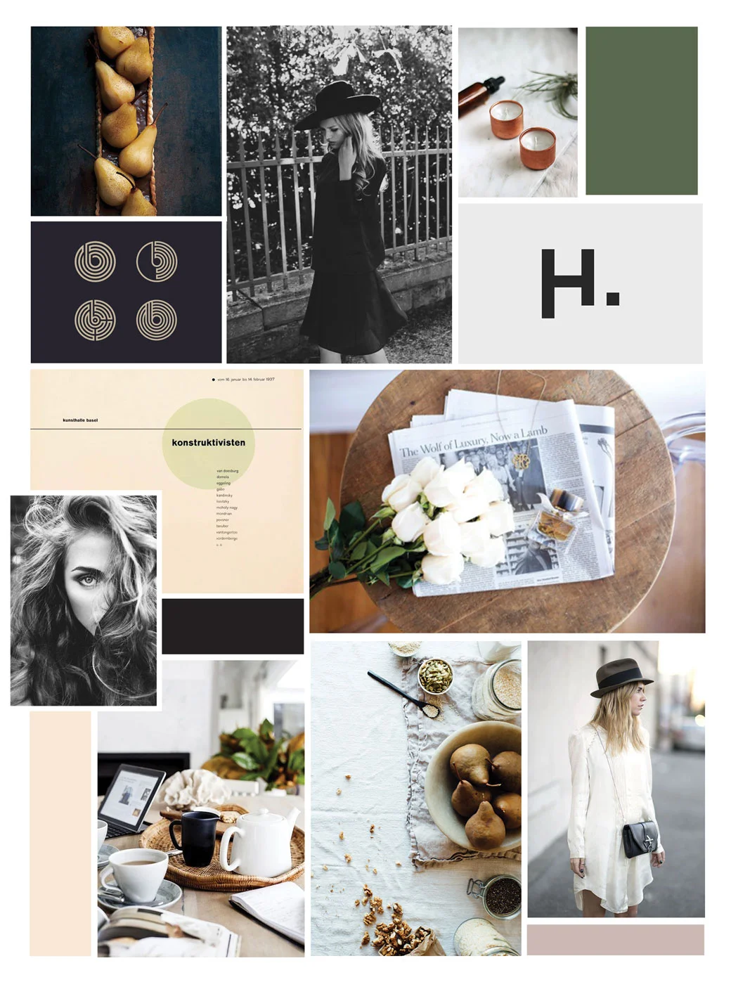
Today's design lesson: branding yourself is nearly impossible. Look and feel is easy. It's the actual logo that I struggle with. Despite what you may think, the above logo is merely a placeholder until I finally land on one I like. I go the handwritten route and then I think that it will be dated quickly. I go the sans serif route, and then I think that it doesn't capture my brand well. Maybe I shouldn't be voicing this, but the struggle is real, and I'd rather share with you than put up a front.
I think this is something, especially as twenty somethings, that we struggle with. We are pulled in so many directions with a million different factors, and as a consequence, we can't find a solid spot for our feet to land. There is a lot of expectation coming into your twenties, and I think most of this chapter is learning to let go of that. At least this is what I'm learning so far. That, and a dozen eggs and a bunch of kale really can last you longer than you think.